As a kid, I was always making things: drawing, painting, building Lego sets and model kits. I had that creative itch early on. I didn’t think of it as“design” at the time. It was just fun.
Music has always been important. My first real love was 2-Tone and Ska; this would’ve been around ’79. I was nine and hooked. But it wasn’t just the music, it was the aesthetic. The stark black-and-white visuals, checkerboard patterns, sharp suits, bold logos. I’d sit in class doodling the logos of The Specials, Madness, Stiff Records all over my schoolbooks and army surplus rucksack. (Back then, rucksacks were heavy-duty cotton canvas, perfect for customising with a Biro.) That was the first time I really felt the connection between sound and design. It wasn’t just record sleeves, it was a whole cultural identity. That moment stuck. It’s probably fair to say it set me on the path I’ve been on ever since.
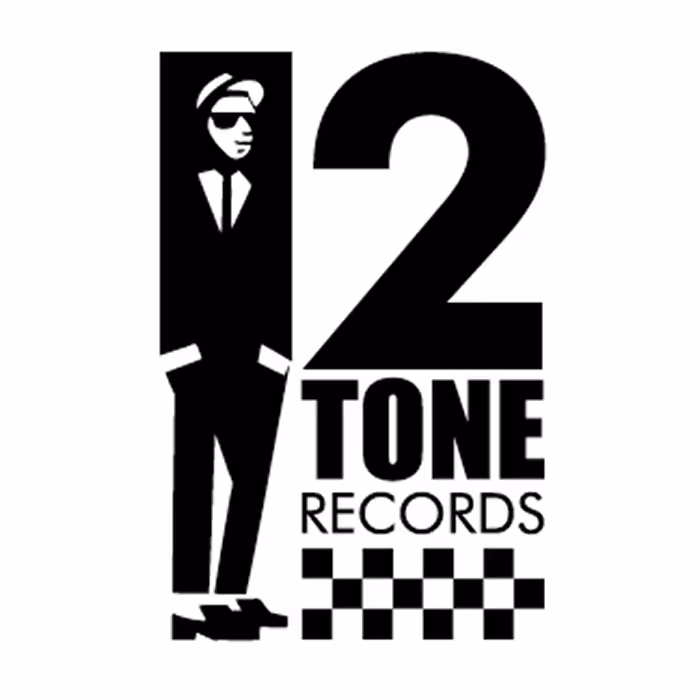
2-Tone logo
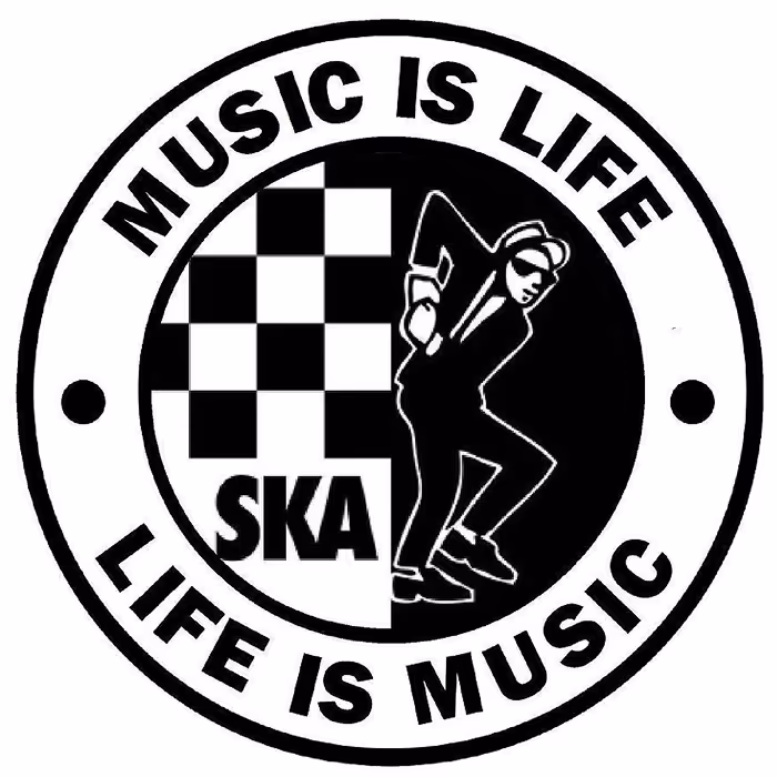
SKA logo
In my teens, the focus shifted a bit. Music led to fashion, and fashion led to DIY. I was into BMX and started customising long-sleeved tees to look like US-import race jerseys. I’d cut stencils of the Haro and GT logos, spray-paint them onto shirts, trying to replicate the look without the price tag. That DIY mindset never left me. Even now, I repaint one of my bikes every year or so, strip it down, rework the graphics, give it a new identity. It’s all part of that same energy: make things your own.
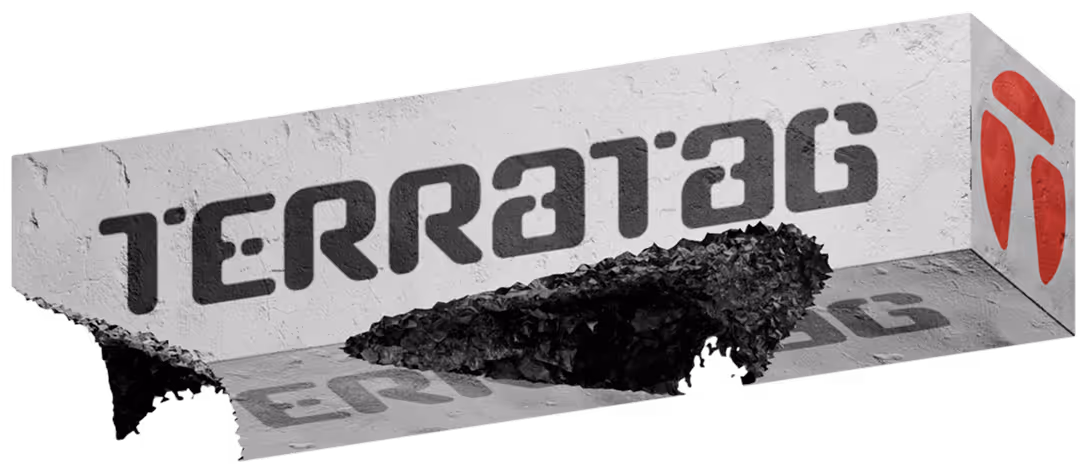
At sixteen, I got my first paid design job, hand-painting T-shirts and jackets for a local shop. The artwork was heavily influenced by WWII aircraft nose art: pin-ups, typography, shark mouths. Those jackets were the early seeds of what I’d go on to do at Prototype 21 and later Terra tag, two fashion labels where the T-shirt was essentially the canvas. I didn’t realise it at the time, but I was already combining illustration, typography, identity, and storytelling - basically design, just outside of any formal structure.
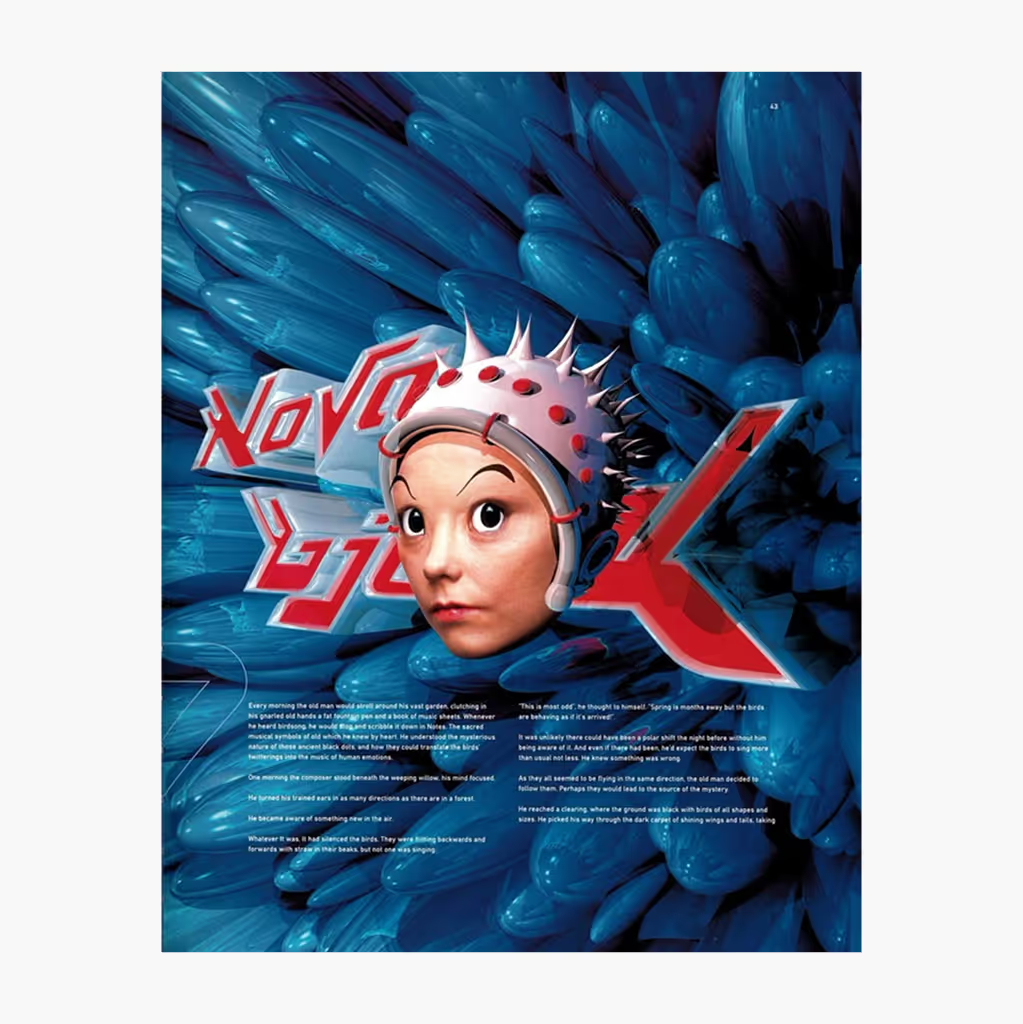
As I moved into my teens, my music taste evolved too. From 2-Tone and Ska I drifted into synth-pop: Depeche Mode, Joy Division, and then into more experimental stuff - Vangelis, Art of Noise, Cabaret Voltaire. That came with its own visual language, more abstract, more conceptual. Album covers weren’t just decoration; they were part of the message. Around this time, I discovered 4AD and the work of Vaughan Oliver, and then The Designers Republic. Vaughan Oliver’s work was otherworldly and textural; not like anything I’d ever seen. And The Designers Republic... well, they just blew my mind. I discovered them through a band from Leeds called Age of Chance. Their work was aggressive, playful, futuristic, political. Straight away, I was a fan.
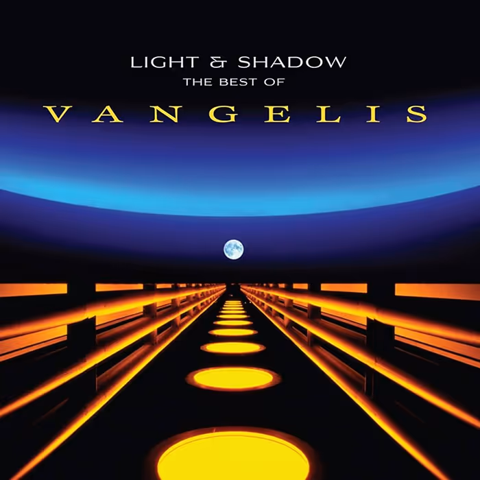
Сover Light And Shadow: The Best Of Vangelis
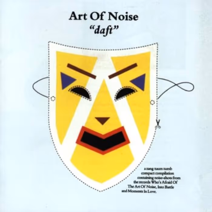
Сover Art of Noise "daft"
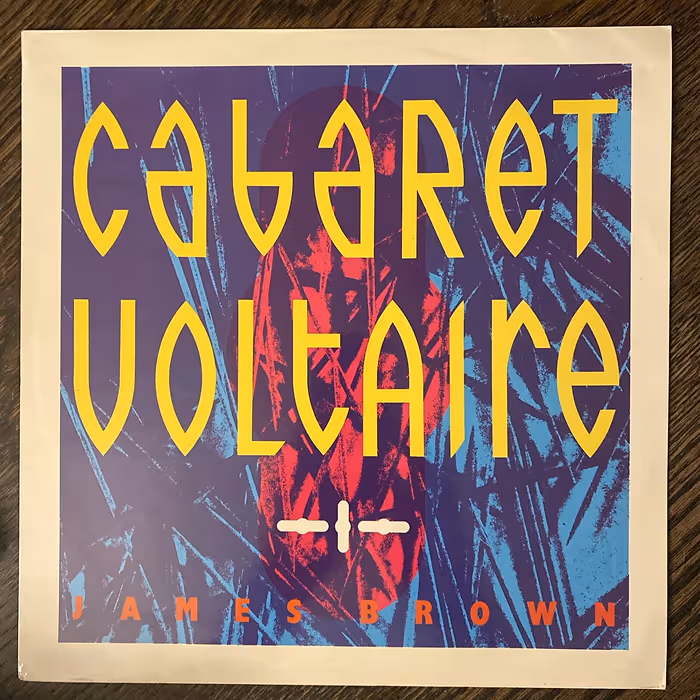
Сover Cabaret Voltaire x James Brown
Music and fashion were always intertwined; one fed into the other. With 2-Tone it was all Fred Perrys, Harringtons, and loafers. Post-punk had its own uniform - white shirts, ties, an anti-punk aesthetic that rejected the ripped-up chaos of the movement before. And then Hip-Hop arrived.I was twelve when I first heard Grandmaster Flash and Afrika Bambaataa. Suddenly, it wasn’t just about the music, it was about art, language, attitude. Breakdancing, body popping, graffiti. That mix of type, colour, the act of rebellion - it was electric. Pretty much straight after skateboarding hit the UK. Not the skinny-board ‘70s version, but the second wave: bigger boards, wider trucks, real tricks. That, too, came with awhole visual culture - DIY punk attitude but with fluorescent colours, baggy T-shirts and vibrant high-top trainers. None of it practical in theYorkshire drizzle, but that didn’t matter. I was in.
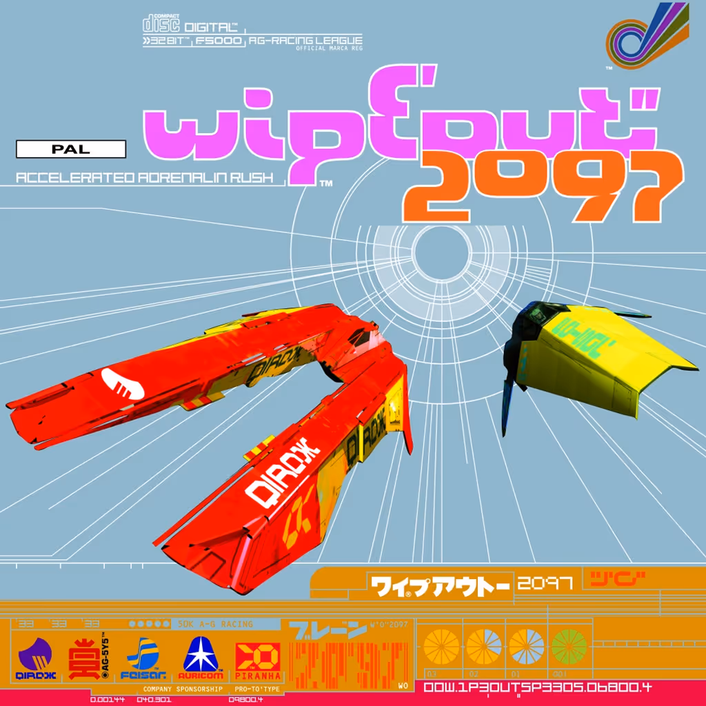
Wipeout - The Designers Republic
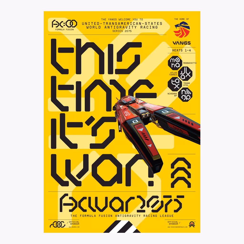
Formula Fusion - The Designers Republic
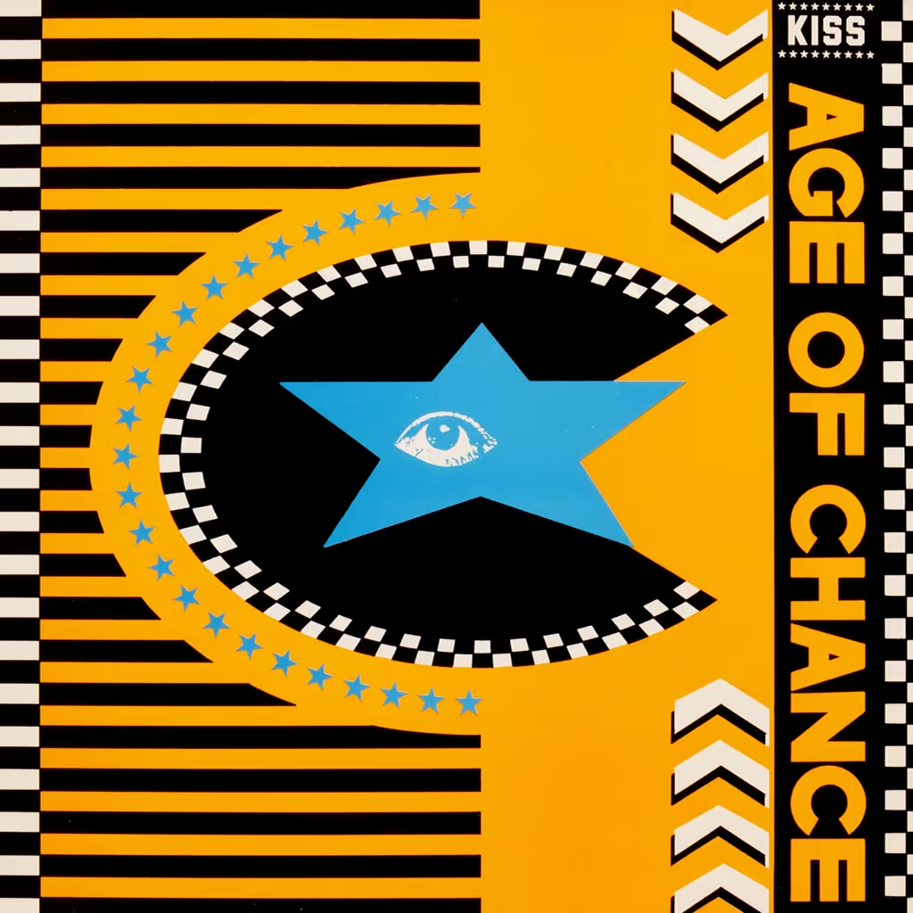
Age of Chance - The Designers Republic
And I guess that’s never really changed. I’m still into the same stuff. Still hunting for visual inspiration - from Tumblr, Pinterest, Instagram. Still hoarding references: architecture, signage, pop-culture trash, hazard symbols, aircraft markings. It’s all fuel. I can trace most of what I do now directly back to being that kid in Harrogate, drawing on his backpack, building model cars, listening to experimental music, and experiencing the world through design.
My path was defined by a clear sense of purpose. I moved to London knowing exactly what I wanted: to work in graphics. That was the world I wanted to be part of. I put everything into making that happen. Immersed myself fully. And I genuinely believe that kind of total commitment puts you in the right place at the right time.
When you’re fully absorbed in something, it becomes instinctive. With design, I wasn’t thinking about it in a conscious, calculated way. It was more like respond.


.svg)
